Yesterday was the 20-year anniversary of WordPress, so it felt like a good time to share this story about the time I gave free webhosting to Matt Mullenweg.
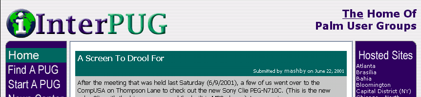
Back in the late 90’s and early aughts, I was really into a little handheld computer called the PalmPilot. The Internet was different back then. There weren’t as many channels of information, and one of the carry overs from the pre-Internet were User Groups. I had created a couple of Palm User Groups (PUGs) and since building web sites was mostly done by hand back then, I saw a way that I could help so I created the International Palm Users Group (InterPUG).